top of page
Golbon Rasoulichizari

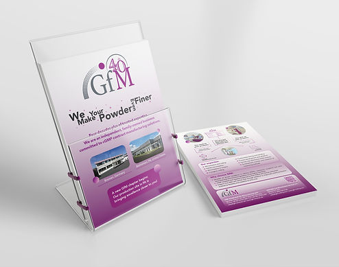
Client: GfM Gesellschaft für Micronisierung mbH
Date: 2024 - Now
Via Rasack Verwaltungs-GmbH team
Led a full visual and brand refresh for the company, including the redesign of the website, business cards, and corporate materials. Developed new brand templates featuring updated colors, typography, and visual guidelines to create a modern and cohesive identity. As the designer and marketing lead, managed the creation of exhibition booths, flyers, banners, brochures, and additional promotional assets. Ensured consistent, high-impact visuals across all touchpoints to strengthen brand presence and support marketing objectives.


bottom of page